Loading project...
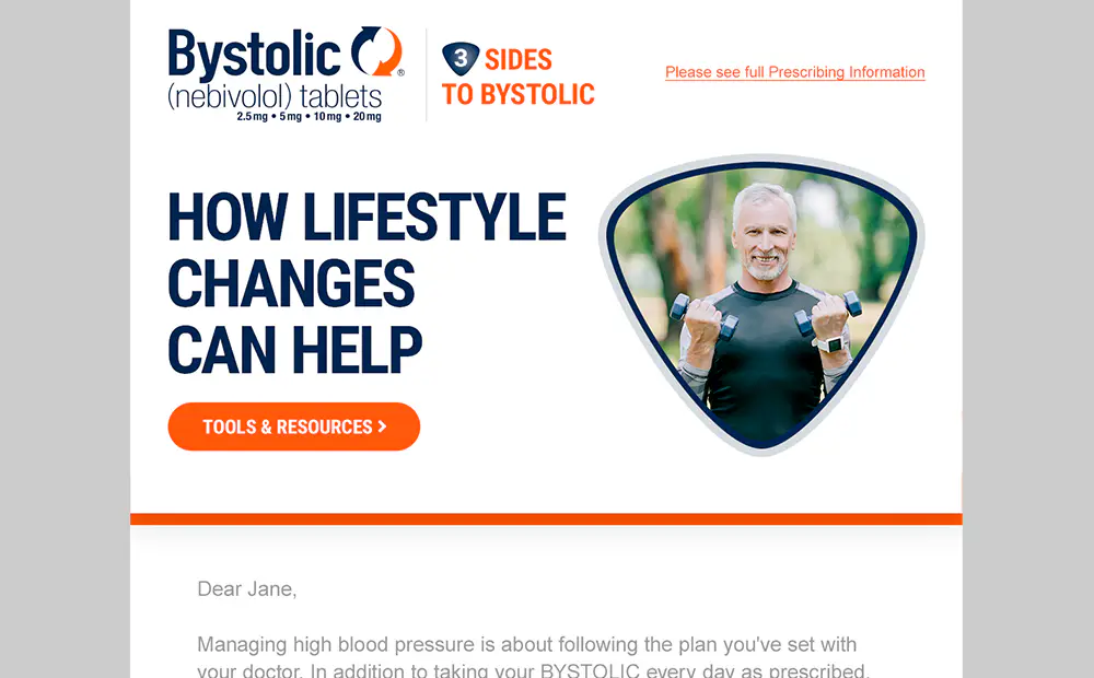
Email Marketing

Full Title: Content-Driven UI Portfolio and Supporting Automation
This is a content-driven UI portfolio platform built to manage, present, and evolve my work while demonstrating interaction design, frontend architecture, and reusable React/Next.js development. Rather than treating it as a static portfolio site, I built it around structured content, custom interface behavior, reusable rendering patterns, and a growing foundation for future projects.
Built with React, TypeScript, Next.js, and Payload CMS, the project brings together content modeling, custom interaction systems, animation, dynamic presentation, rendering strategies, and route-aware UI behavior in a single evolving codebase. My primary focus is the frontend: polished browser-based experiences, reusable UI architecture, and carefully shaped interaction patterns.
I owned the requirements, content structure, integration points, debugging process, deployment decisions, and implementation review across the frontend, CMS, deployment, and automation layers, with responsibility for shaping technical decisions and carrying implementation through to production.
Beneath the visible UI is a broader engineering layer: structured content workflows, YAML/HTML import/export, CMS-managed CV and project data, NDA-aware content handling, S3 media workflows, ISR/revalidation, deployment scripts, environment guardrails, and developer tooling. I keep an expansive main features list to document the full engineering scope without overloading the project description.
Several pieces are candidates to become standalone npm packages, reusable boilerplate, or extracted patterns for future React/Next.js projects. The current AWS deployment is intentionally cost-constrained, with dev and prod sharing a single EC2 host while the system evolves toward stronger reuse, isolation, and portability over time.
Full Title: Slideshow Component
This project is a reusable React slideshow component built around React hooks, composable state, and interactive UI behavior. Rather than treating it as a one-off carousel, I designed it as a flexible slideshow system that can support different presentation styles, control patterns, and content structures within the same core architecture.
Built with React, TypeScript, and SCSS, it supports auto-slide behavior, manual navigation, optional dynamic routing for deep linking, image preloading, dynamic height adjustment, and multiple control sets. Slides are driven by a configurable data structure that can combine background imagery, thumbnails, and JSX content, making the component adaptable to a range of layouts and use cases without changing its core logic.
The component uses custom hooks, accessibility support, and modular controls to keep interaction logic organized as the feature set expands. It demonstrates a reusable approach to building richer stateful UI components, with enough flexibility to support multiple slideshow experiences without rewriting the underlying behavior.
Full Title: Exact Sciences Website
While working at Epsilon, I contributed to the development and ongoing refinement of Exact Sciences web properties, including the Cologuard website, building front-end experiences within a Sitecore-based enterprise CMS environment. The work involved translating design and content requirements into scalable, production-ready interfaces for a large healthcare brand operating in a space where clarity, accessibility, performance, and compliance carried real weight.
My role centered on front-end implementation within a component-driven architecture, creating modular, reusable UI components and maintaining consistency across templates, content types, and brand patterns. Working primarily with JavaScript and CSS, I helped build interactive features and dynamic content presentations that needed to perform reliably within an enterprise CMS while remaining flexible enough to support evolving marketing and content needs.
I also collaborated closely with designers, backend engineers, and QA to turn Figma-based designs into production-ready responsive interfaces with strong visual fidelity. A standout contribution was an interactive oncology report explorer designed to help patients and healthcare providers better understand diagnostic information through guided visuals and structured data presentation. Even though the feature was later retired during a redesign, the work remains a strong example of building user-focused interfaces for a complex, regulated healthcare environment.
Full Title: Golden 1 Credit Union Website
While at Epsilon, I contributed to the Golden 1 Credit Union website, building and refining front-end features within a legacy stack centered on jQuery and Sitecore. Working inside CMS-rendered components and existing platform constraints, I helped translate managed content into interactive UI behavior while supporting reusable modules used across the site.
My work included building and improving interactive modules such as accordions, a bank card comparison tool, and other shared interface patterns, while also focusing on performance, accessibility, and SEO hardening. Using tools like Lighthouse, I helped identify and reduce front-end inefficiencies through code cleanup, script deferral, media optimization, lazy loading, and targeted improvements to layout stability and page performance.
I also contributed to accessibility fixes, cross-browser QA, analytics verification, and component documentation, helping make the front end more predictable, maintainable, and resilient within the realities of a mixed CMS environment. The project stands as a strong example of improving a production site through practical engineering decisions, even within the limits of an older architecture.
Full Title: Modular Email and Marketing Consent Workflows
While at Epsilon, I contributed to digital marketing systems for AbbVie, Takeda, and other pharmaceutical clients, building reusable modular email templates in Salesforce Marketing Cloud (SFMC) to support responsive layouts, variable content, localization, and consistent brand execution across regulated markets.
Alongside that work, I contributed to OneTrust integration flows and localized marketing preference centers for pharmaceutical clients including Takeda, helping connect consent management, subscription controls, and campaign infrastructure across platforms. This included configuration within OneTrust and customization with embedded FreeMarker logic to support consent synchronization, data routing, and region-specific requirements.
Across these engagements, I worked at the intersection of frontend delivery, marketing technology, privacy, and compliance, helping support more reliable and maintainable systems for regulated digital communication.
Full Title: USDA/NIFA Pushgraph Application
Pushgraph was ChalkLabs' flagship data-analytics and knowledge-discovery platform, used by government agencies and research organizations to visualize relationships within large, complex datasets. I designed and developed the 2017 UI during a roughly two-month rebuild of the platform, ramping up quickly in Angular while owning the front-end implementation and visual execution of a modular dashboard system.
The core experience centered on a drag-and-drop, modular analytics dashboard that allowed users to assemble interactive panels around their workflows. I independently built the drag-and-drop widget framework, defining component structure, interaction patterns, animation states, and integration points with the platform’s underlying data systems.
I delivered production-ready widgets including infinite-scrolling data grids and interactive visualizations using Mapbox and Highcharts, consuming both REST and GraphQL APIs to support live data and configuration. Because the platform was restricted, no public demo is available, but the work remains a strong example of building enterprise-scale dashboard UI and complex visualization workflows for data-intensive environments.
Full Title: What is Second Step Landing
Through Creative Circle, I was engaged as a freelance front-end developer to help conceptualize and build an interactive experience for Committee for Children’s Second Step program, designed to communicate the scope and structure of the curriculum in a more visual, intuitive way.
The result was a multi-layered wheel navigation interface built with React, React Motion, and SVG. I led technical advising, prototyping, and front-end development, working closely with designers and stakeholders to shape an interaction that was responsive, understandable, and well suited to educational content.
The component combined animated transitions, data-driven layers, and responsive behavior with careful attention to accessibility and performance. It stands as a strong example of using motion and vector-based rendering to make complex information easier to navigate and understand.
Full Title: Merit & Preferred Choice
This informational landing page was built for Premera Blue Cross to help members better understand plan benefits and make more confident care decisions. The core challenge was turning complex healthcare information into something clearer, more scannable, and easier to act on without losing the credibility and restraint expected in that space.
I implemented the experience within a legacy jQuery-based front end, focusing on a polished, responsive result within existing architectural constraints. The page was built to behave reliably across devices and browsers, with attention to accessibility, responsiveness, and integration with Premera's marketing ecosystem, including support for email deep links and query-string-based content tailoring by state or audience segment.
A standout interaction was a modal carousel that subtly blurred the background to direct attention without overwhelming the content. Delivering that effect consistently required careful handling of CSS filters, compositing, and stacking behavior across browsers. The project is a strong example of bringing clarity, polish, and durability to a user-facing healthcare experience built within a legacy front-end environment.
Full Title: Mobile Data Share Planner
This JavaScript web application was developed for AT&T Wireless to help customers estimate total mobile data usage across multiple devices and choose an appropriate shared data plan. Users could interactively select device types, usage categories, and consumption levels, with real-time visual feedback and pricing updates helping guide decisions.
The application was built using a RequireJS / AMD module architecture, reflecting an early focus on bringing structured, class-like organization to front-end JavaScript before ES6 modules or TypeScript were standard. Influenced by my background in ActionScript 3, the system emphasized separation of concerns, reusable logic, and maintainability, allowing the same foundation to support multiple AT&T data-usage tools across different marketing initiatives.
A secondary interaction layer, revealed through an “Estimate my monthly usage in detail” flow, offered more granular breakdowns and custom calculations for users who wanted a deeper estimate. The project predates AT&T's transition to responsive design and was implemented as a fixed-width desktop experience, but it still reflects a strong emphasis on interactive decision support, reusable front-end architecture, and scalable UI logic for a large consumer-facing tool.
Full Title: The Ultimate Bikini Bottom Buddy Search
This project is a Where's-Waldo-style hidden-object game set in the SpongeBob SquarePants universe. Across five cartoon levels, each stage introduced a distinct play style, from classic character-finding puzzles to variations involving x-ray vision, darkness searches, and a submarine-radar finale. The experience was designed around variety, reward, and exploration rather than pure difficulty.
The game was built in Haxe using the Flambe engine, targeting both Flash and HTML5 to support the mix of legacy and modern browsers common at the time. I implemented the entire UI flow, core framework, and gameplay logic across all levels, with a built-in cheat mode included for demonstration and QA.
Although Haxe and Flambe unified much of the codebase, the project still required a strong grasp of both ActionScript and JavaScript, especially around performance tuning, event models, and platform-specific behavior. More broadly, it reflects my ability to adapt across tools, constraints, and interaction styles while building user-facing systems with meaningful variety and technical range.
Full Title: Expiration Date
Expiration Date is a post-apocalyptic escape game in which players wake after a nuclear disaster to discover their DNA fused with that of a tomato. Set inside a surreal suburban home filled with environmental hazards, dark humor, and escalating puzzle logic, the game combined absurd narrative with structured interaction design and layered problem-solving.
I built the game's core framework and logic system, designing it so multiple developers could build and test levels independently while maintaining consistent behavior across the project. That architecture allowed rooms and puzzles to be developed in parallel without repeatedly changing shared logic, making the project faster to iterate and easier to scale collaboratively.
Rather than scattering conditionals throughout the codebase, I defined the full game state through a single JSON-driven data model describing objects, states, interactions, and relationships. This made the system easier to inspect, debug, balance, and extend, while also supporting levels I authored myself alongside contributions from other developers. The project remains a strong example of data-driven interaction architecture built for both flexibility and collaboration within the Haxe / Flambe / Flash ecosystem.
Full Title: Nickelodeon Ultimate Trivia
Nickelodeon Ultimate Trivia Game is a fast-paced, franchise-spanning quiz game featuring more than 2,000 questions drawn from across the Nickelodeon universe. The experience combined classic multiple-choice gameplay with multimedia prompts, creating a replayable format built around speed, variety, and brand consistency.
I built the game end to end—aside from animator contributions—using Haxe and the Flambe engine to deliver both Flash and HTML5 versions. That dual-target approach allowed the project to perform reliably across the mix of legacy and modern browsers common at the time, with careful attention to timing, responsiveness, and visual polish.
My work included the quiz engine, timing and scoring logic, category selection, progression systems, and full UI flow from menu to results. I also implemented a data-driven content pipeline that allowed non-engineers to add and update questions and assets without changing core code, making the game more scalable and maintainable as content expanded. The project stands as a strong example of building a content-heavy interactive system with full ownership across gameplay, UI, and supporting architecture.